Robert Dyas – Developing an iconic brand

When the opportunity arose to pitch our branding services to Robert Dyas, a popular retail chain operating across Southern England and the Midlands, m360 was very happy at the prospect. Established in 1872, with 93 high street stores offering home, garden, kitchen, and DIY products, this was a project that the whole agency was eager to be involved in. It was clear from the beginning this was going to be a large project, but we were more than ready to take it on.
Feeling excited to be approached by one of Theo Paphitis’ brands, we focussed our pitch on a range of our client success projects, drawing out the many gifts working with m360 brings. With the brief being to provide brand clarity, we identified initial inconsistencies in their current branding with creative exploration of the brand’s potential, which was appreciated by the Robert Dyas team.
Moving forward, to ensure that m360 fulfilled the brand’s aspirations, a brand immersion workshop was conducted at Robert Dyas’ London Head Office. This allowed us to identify a key issue with the current branding strategy, zooming in on the cohesion of their omni channel presence. As a result of Covid-19 affecting shopper behaviour, the Robert Dyas brand was no longer harmonious with the instore experience. We saw this as an opportunity for potential growth, by reinjecting confidence back into the instore and online brand experience.
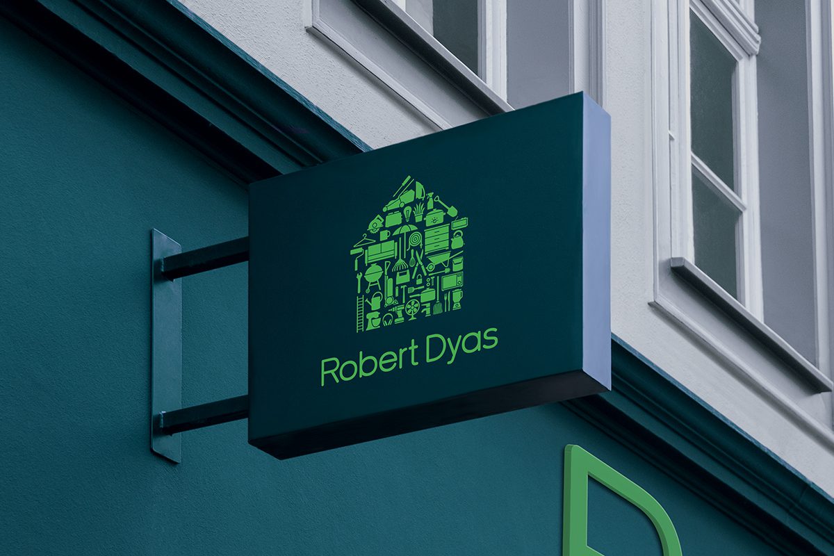
The ultimate solution was to create a clear set of brand guidelines with honed creative direction. We started by exploring an evolution of the core branding, balancing a modern and versatile aesthetic with sensitivity to their proud brand heritage. At this stage, it was important to interrogate the existing suite of brand icons to see how these could be refined and developed. Most proudly we transformed their existing house graphic, creating a confident hero brand graphic that could be utilised across all shopping channels.
The initial core identity was presented with brand analysis, strategy, colour, logo, TOV, and strapline options, plus brand application examples for store fascias, wayfinding, apparel, packaging, and brochures. Working collaboratively with the Robert Dyas team to further develop this, the result was a strong bespoke suite of icons that integrated with core branding and could be used elsewhere to represent their product ranges.
After sign-off on the core assets, the first iteration of the brand guidelines document was presented. Development continued from this point forward, and the latest version included all core branding for online and offline, an expanded colour palette, and brand application examples. This included detailed exploration and decision-making into the core brand colour (teal and green), which led to designing the Saffron Walden store fascia. The store opened with a grand ceremony in February 2023 and received positive responses from all stakeholders.
Most recently, we developed a Google Slides template and bespoke icons to help Robert Dyas’ internal presentations look professional and consistent. Along with a brand handbook that helped the employees understand the brand’s objectives, personality, and business strategy.
Overall, we are very proud of the successful refreshed brand identity we created for Robert Dyas, delivering consistency and personality across all channels. We are pleased to have realigned their marketing and branding efforts to target the true Robert Dyas customer and unlock a new potential for business growth.
Testimonial
“My team have really enjoyed working in partnership with m360. We had the brand insights, and we knew what direction we needed to head in, but it was m360 who navigated us there. m360 understood the brief from the get-go and really got under the skin of our brand vision in order to ensure the project was efficient and most importantly effective, both for the customer and commercial impact.
The m360 team asked all the right questions and offered insightful guidance to ensure that our brand refresh truly represents what we stand for & the direction we’re taking Robert Dyas. Their approach is always collaborative, accommodating and creative, they have knitted together all of the necessary elements to add real clarity to our brand identity.
If you’re looking for a team of talented and dedicated professionals, who are down to earth and genuinely listen to your needs; look no further than m360.”
Kate Squires – Marketing & Brand Director


