The science of success

Cawood Scientific is the UK’s largest independent provider of analytical testing and sampling services for the land-based industries. As such they present with a complex brand portfolio; themselves the umbrella brand to six specialist divisions.
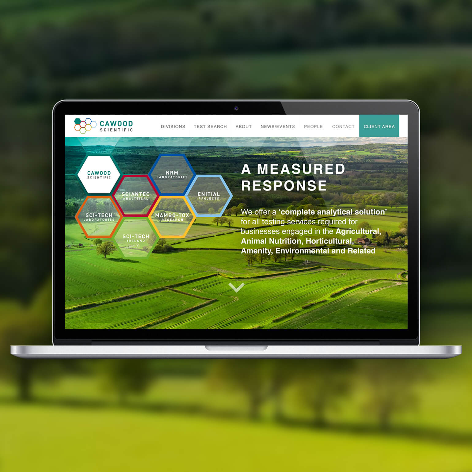
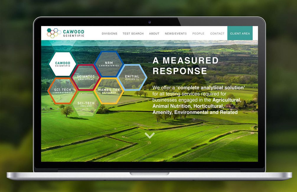
It was our job to clarify their service offering with a family of linked visual identities. We adopted a hexagonal device and a colour suite that both differentiated and unified the sub-brands. This was combined with rich photography.
The resulting creative is clear and optimistic; the complexity of the business not a burden on the customer. The subject matter may be formal but the project was a joy for our studio because it embodies graphic design’s raison d’être – communication that is beautiful because of its simplicity.


