The art of wayfinding: What makes successful wayfinding design?

Wayfinding design is an important part of optimising the visitor experience, no matter what the industry or location.
Wayfinding is the process of navigating around a physical space. The signage and facilities involved in ascertaining where they currently are, figuring out a route and confirming that they have reached their destination are all part of wayfinding.
Different types of wayfinding signage
There are four key types of wayfinding signage, each of which is essential to the success of your wayfinding strategy:
Identification signs, such as door plaques and building names
Directional signs, including junction signage and floor directories
Informational signs, such as those detailing amenities or business opening hours
Regulatory signs, including safety signage and rules such as no smoking
Why is wayfinding design important?
Successful wayfinding design helps to improve the visitor experience, making it easier for people to get around and find what they’re looking for. An enjoyable, stress-free experience will encourage repeat visits, while a confusing layout without clear directional signage could cause a person to leave without making a purchase.
What makes a good wayfinding strategy?
Just like marketing, successful wayfinding requires a strategic approach to get the best results. Here are some key considerations for designing your wayfinding strategy.
Functionality
Making sure your signage is accurate and functional is the most important step. Consider the real journeys that visitors will take, from entrances and exits to possible choke points. This will help you to devise routes that work well and keep people moving. Make sure directional signs point the right way and don’t lead visitors in a circle or to a dead end.
Simplicity
When you design signage for wayfinding, you should do so for a person who has never visited the premises before. This will help you to ensure that your signage design is easy to understand. Signage with universally recognised symbols, clear directional arrows and even colour coding are some great ways to get the job done. You’ll know you’ve got it right if it feels intuitive.
Accessibility
Making sure your premises meet accessibility regulations includes providing adequate wayfinding solutions, particularly those relating to fire exit signage and alternative routes for wheelchair users. Remember as well that not all visitors will be able to read or understand text signage, so make smart use of colours, symbols and photographs to communicate clearly at a glance.
Consistency
Using a consistent design language throughout your wayfinding strategy will make it easier to recognise and understand. While some of your signage design will have to meet certain requirements, such as safety warnings, there’s plenty of potential to develop branded wayfinding. Incorporating your branding into directional signage and other wayfinding solutions will help to strengthen your identity, while also making it clear that people are in the right place.
Creativity
The most important part of wayfinding design is making sure it’s actually functional, but this doesn’t mean that you can’t have fun with it. Creative directional signage is a great way to build a stronger brand presence and develop an immersive experience for visitors. For example, wayfinding signage at Disneyland is often themed to fit the area of the park it’s in.
Looking for a wayfinding specialist?
We are signage design specialists that have honed our wayfinding capabilities across stations, shops, universities, airports, animal hospitals and more.
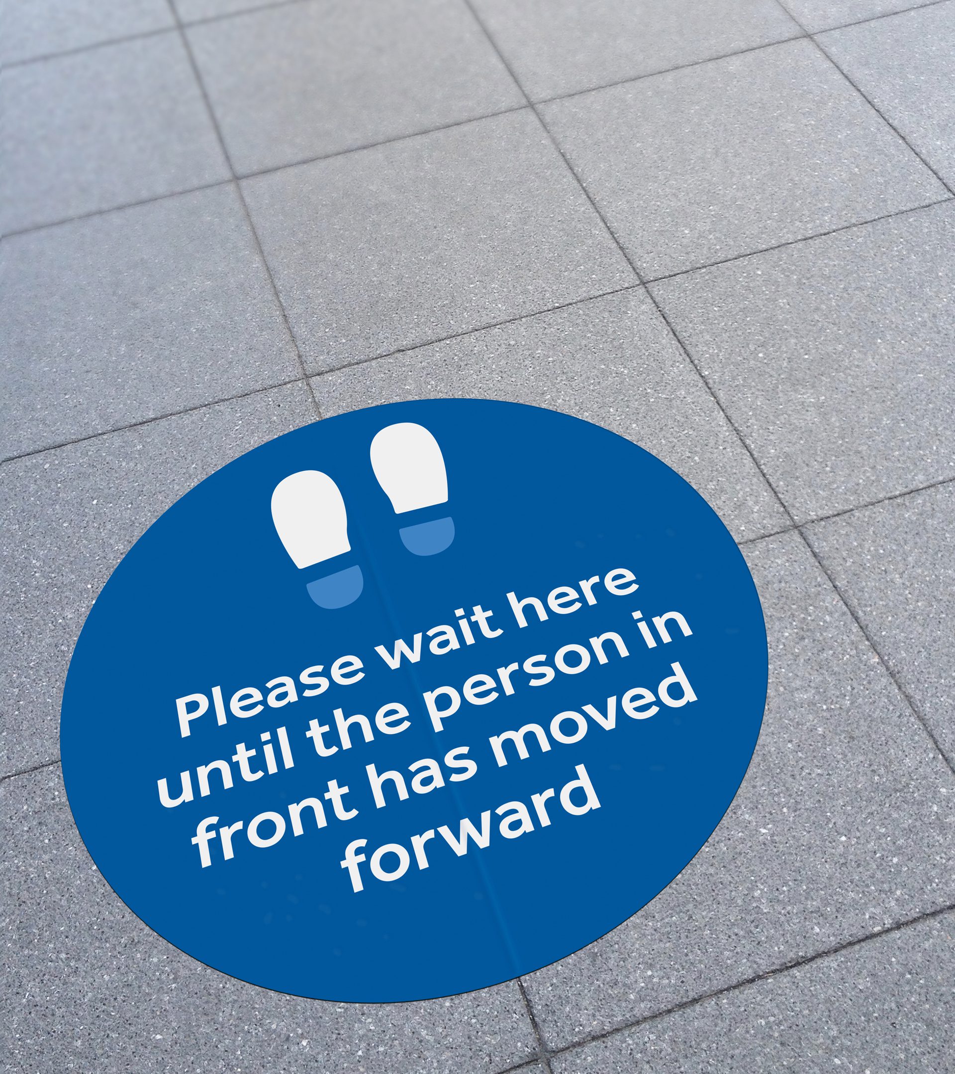
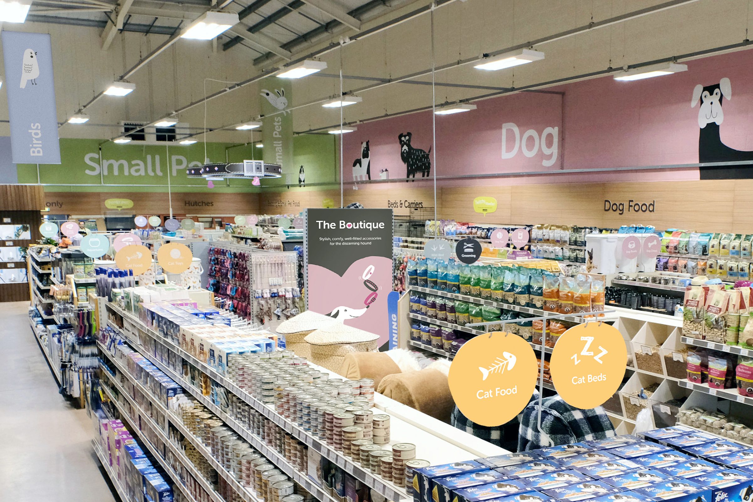
We provided wayfinding solutions as part of the branding project for Planet Bounce, where signage had to be in line with the brand’s futuristic graphics and easy to understand. During the COVID-19 pandemic, we worked closely with East Midlands Railway to deliver a nationwide social distancing campaign, including comprehensive directional signage at 91 train stations. Our development of the iconic Robert Dyas brand involved shop signage and retail wayfinding to streamline the shopping experience, and we created the eye-catching branding that Bonington Gallery used as part of their updated and unmissable exhibition wayfinding.
If you’d like m360 to develop exciting, functional wayfinding design for your business, get in touch and we’ll be happy to provide navigational clarity to your space. From developing your brand to creative design for print production and signage, we’ve got all the skills you need for a successful wayfinding strategy.
