
megabus
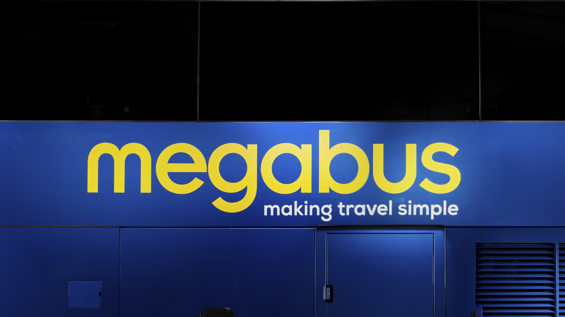
megabus is a popular value coach operator in England, Scotland and Wales, carrying millions of passengers each year to popular city break and tourist destinations. When the team at megabus approached us to bring clarity and impact to their brand identity, we jumped on board and shared the benefit of our strategic brand building knowledge.

First stop
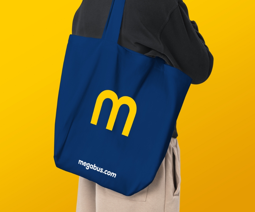
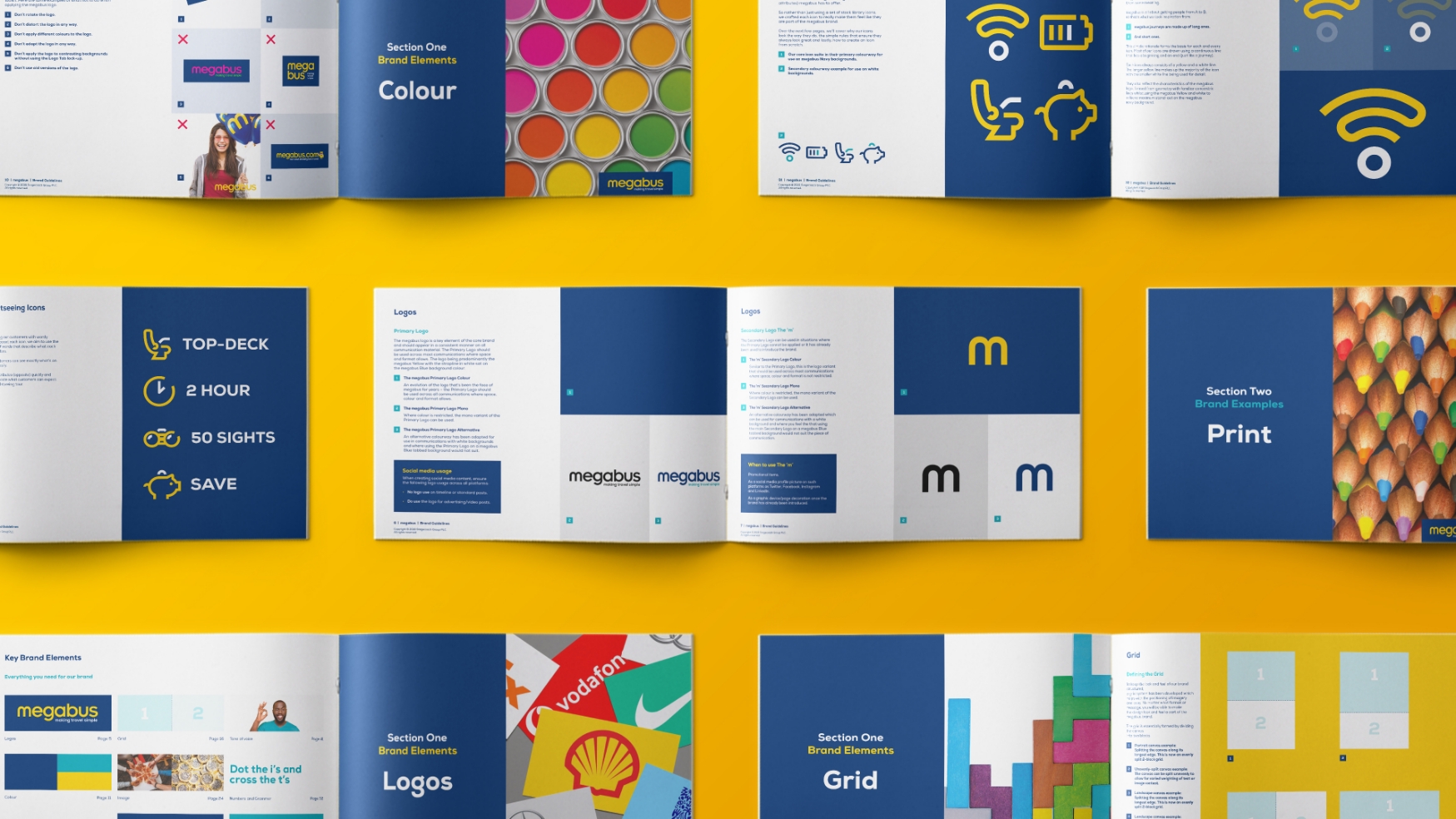
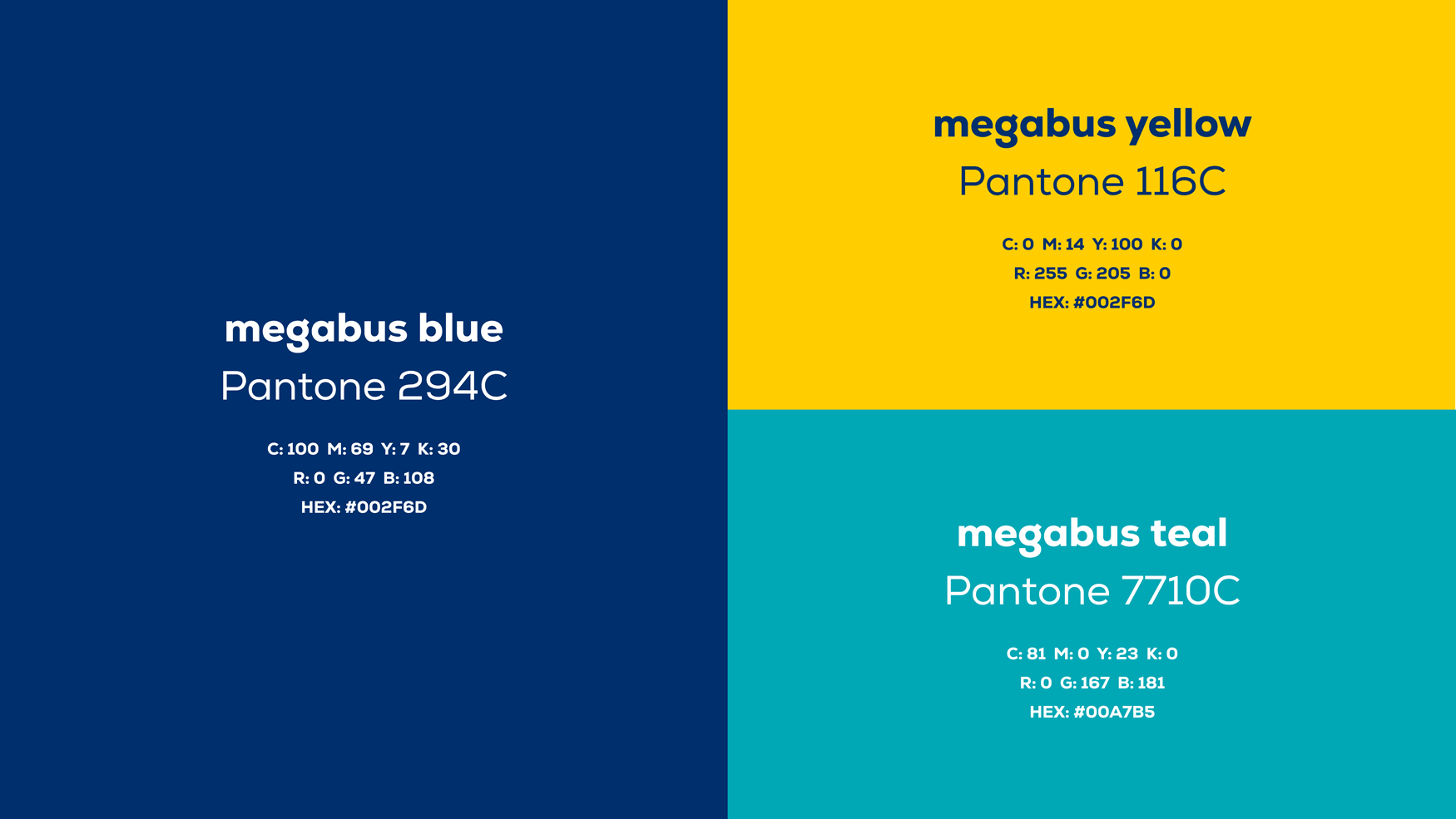
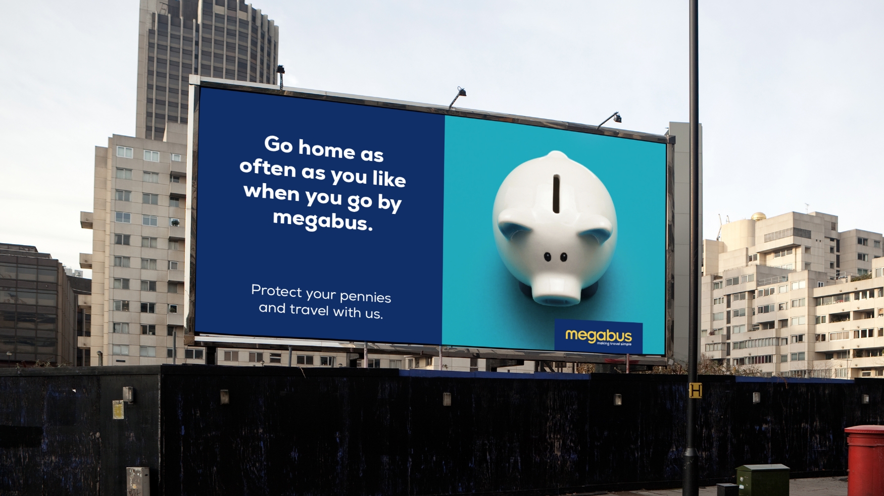
We began with the creation of comprehensive brand guidelines to establish clear boundaries and rules when applying the logo, colours and wider brand assets. We also introduced unique icons to capture the brand’s USPs, with colour usage offering a visual metaphor for the long and short journeys that megabus operates across the UK.
Journey highlights
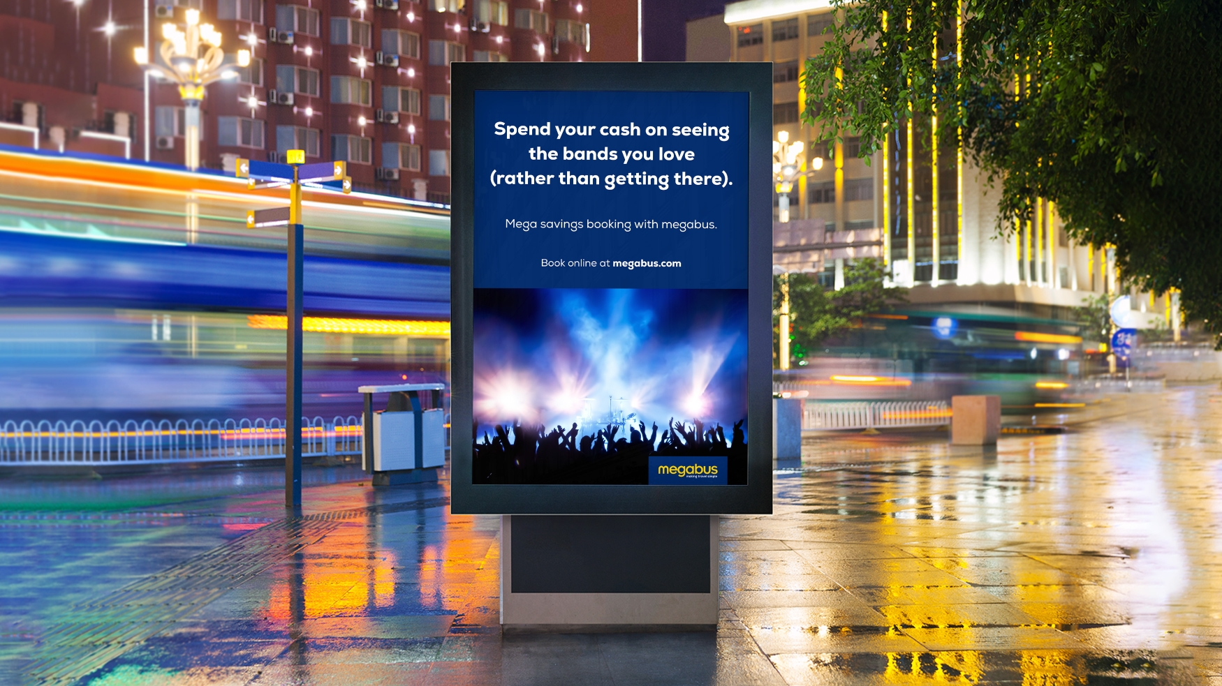
megabus’ tagline, ‘making travel simple’, became our guiding principle for customer-facing communications, resulting in a straight-talking but gentle and relaxed tone of voice which would endear itself to customers while at the same time, prompting them to book or take an action.
Making messaging simple
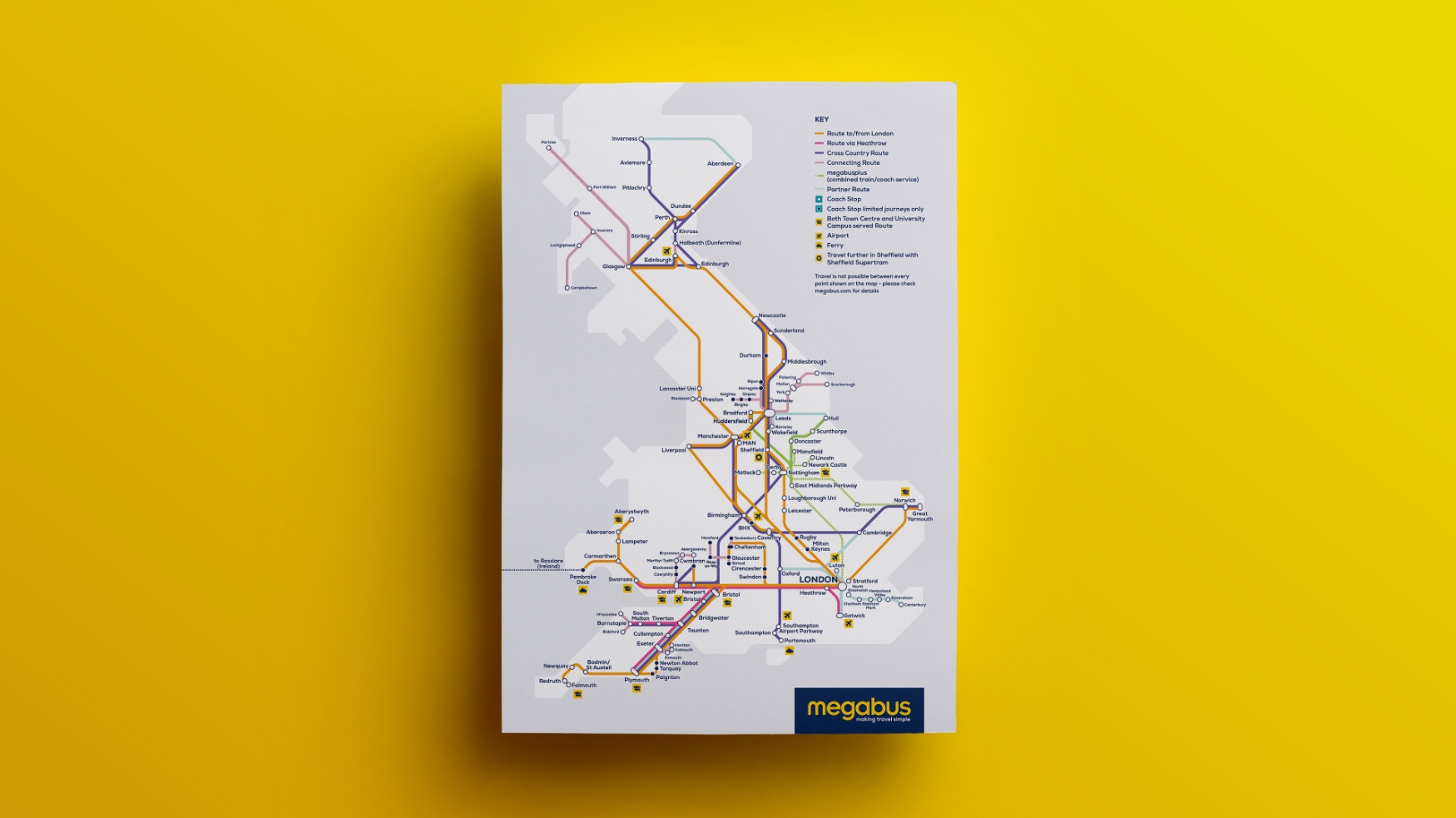
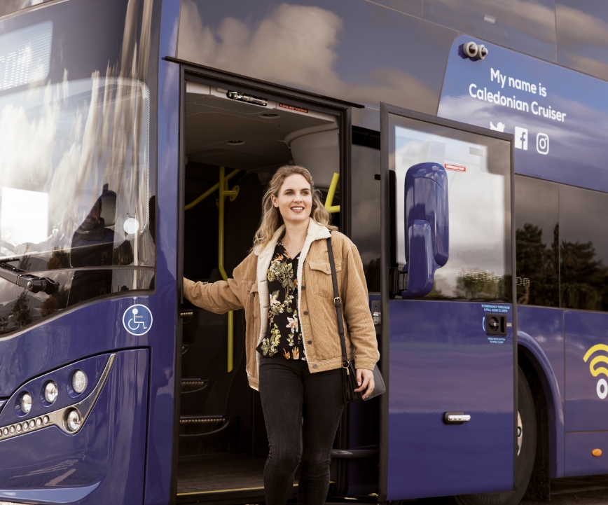
To encompass megabus’ varied communications, we defined three photography styles: Abstract, Service and Location. Abstract linked directly to a message, while Service focused on quality and service levels and Location hinted at places and events customers can visit. Our involvement in the brand’s repositioning was a resounding success, allowing megabus to hit the road with greater confidence and a clearer position in the minds of consumers.
The ultimate result of the brand guidelines project has been the 80 page guidelines document created by m360. This is now our go-to guide for both our internal team and third party stakeholders, when managing all brand communications and ensuring consistency in visual style. m360 was able to guide us through the process of redefining our company brand and vision, and we are really happy with the results.
Group Head of Marketing & Brand Strategy, Stagecoach