Showcase Cinemas: a website blockbuster

In today’s competitive market, Showcase Cinemas recognised the need to stay ahead of modern tastes and consumer trends by revitalising its website with a contemporary design and an enhanced user journey. The previous website was cumbersome and outdated, failing to capture the comprehensive offerings and welcoming atmosphere that Showcase Cinemas is known for.
The newly launched website features a streamlined design that significantly enhances user experience. It simplifies the ticket booking process and incorporates advanced functionality for users to manage their Insider memberships, including Apple Wallet integration.
The project began with a strategic review of competitor websites and an analysis of Showcase’s goals. This informed the development of a sophisticated colour palette that resonates with a diverse audience while maintaining a professional edge. Future-proofing the website was paramount. To achieve this, a bold and simplistic colour palette was selected, complemented by clear buttons and typography that align seamlessly with Showcase’s broader marketing strategies.
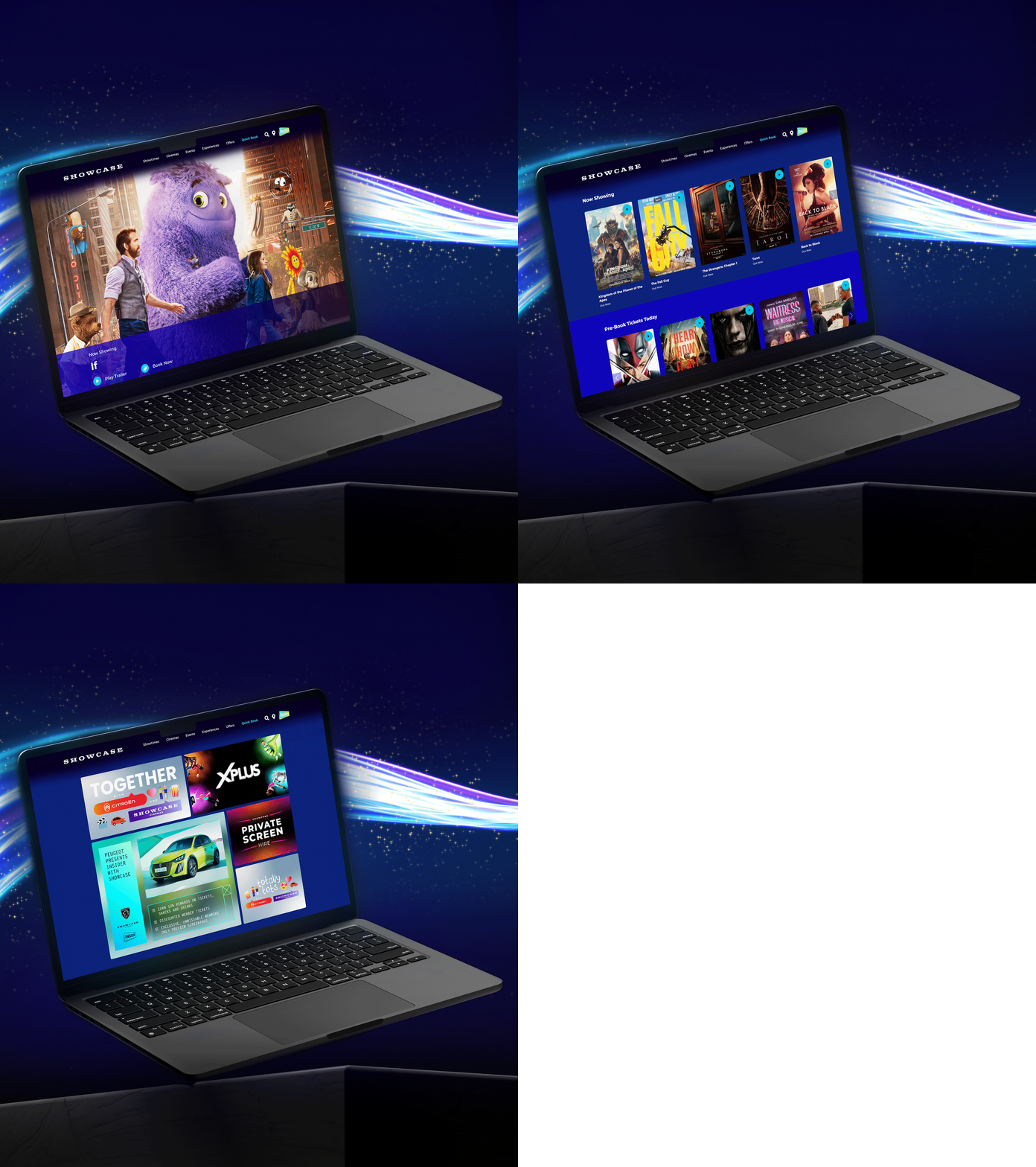
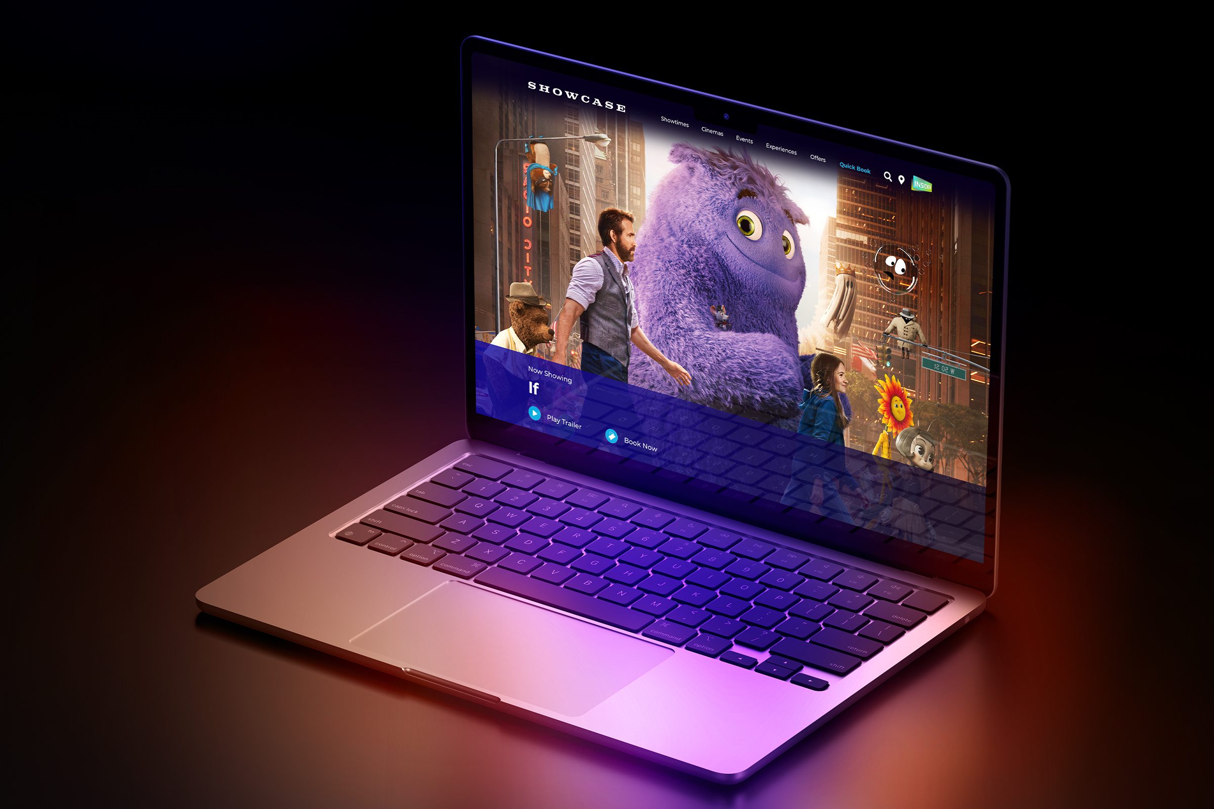
Focus then turned to crafting a visually appealing and functional homepage, featuring responsive banners and icons optimised for various devices, which was subsequently rolled out across the remaining web pages. Following UX/UI best practices was important to ensure the site delivers the effortless navigation users expect from top-tier online services.
Visitors can now effortlessly browse films that are currently showing or coming soon, as well as current offers and showtimes at each cinema location. Additional showcase services that were previously buried on different landing pages are now prominently displayed on the homepage, allowing users to easily book tickets for Showcase’s unique viewing experiences like Totally Tots, XPlus, or private screen hires.
The webpages for Showcase’s loyalty program, Insider, also underwent a significant transformation. The new information page is strategically designed to drive membership growth by highlighting the extensive benefits of joining Insider. The member area was reimagined to enhance usability, presenting key information and current balances first, followed by promotions and upcoming films. Additional marketing collateral was designed for social media to announce that Insider has gone digital, eliminating the need for physical Insider cards.
Since the launch, Showcase Cinemas has experienced a significant increase in website traffic and a surge in new Insider memberships, demonstrating the success of this comprehensive digital transformation. User feedback has been overwhelmingly positive, with many praising the intuitive navigation and the ease of booking tickets for their favourite blockbusters.
This digital transformation underscores our commitment to driving innovation and user-centric design, solidifying Showcase Cinemas’ position as a leader in the entertainment industry.
