KRM for all!

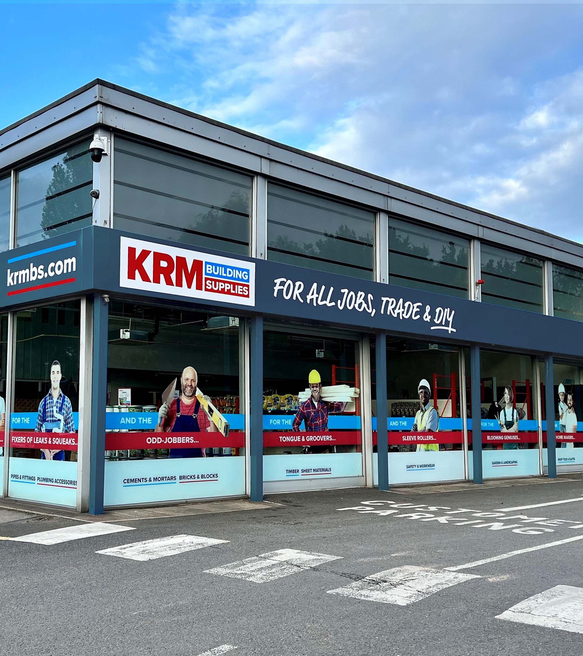
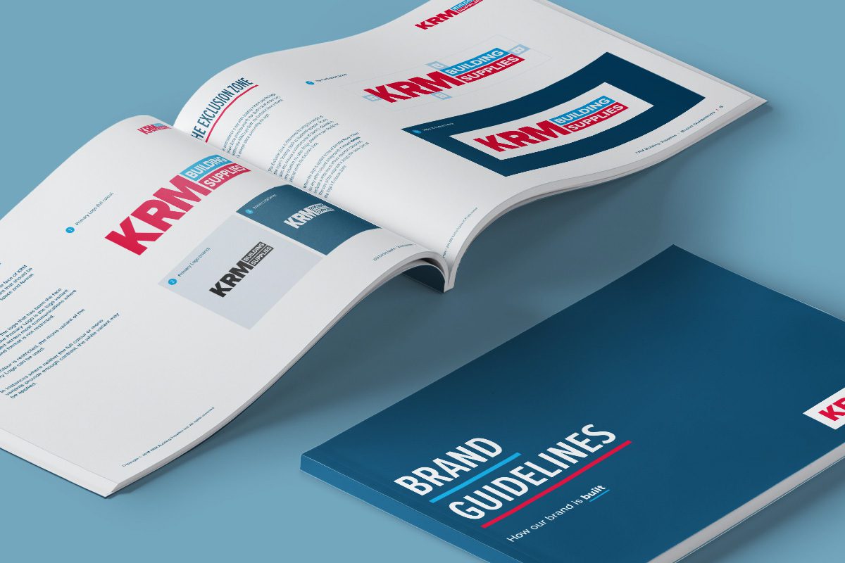
We started a brand refresh journey with KRM Building Supplies all the way back in 2019. This wide-ranging project involved developing the master brand, crafting brand guidelines for their design team, updating the livery for an entire fleet of vehicles and rebranding key collateral such as the iconic KRM builder bags. When the pandemic hit and brought uncertainty across the board, store upgrades were put on hold, so we’ve been delighted to release the brakes and roll out the fresh identity at KRM’s Ilkeston building supply store.
KRM has recently shifted their focus from predominantly trade customers to a broader, more consumer-focused strategy. As we have an in-depth understanding of the KRM brand and hold a strong relationship with their management team, m360 was the obvious choice to realign the branding following this change in direction. Trade-focused stores can feel intimidating to the weekend DIYer, so we needed to create a welcoming presence, whilst reassuring existing trade customers and retaining the brand equity that KRM has built over the years. As Ilkeston is KRM’s flagship store, a strong customer experience for all is crucial to the brand’s success.
Our talented team of designers produced bold, creative artwork for brand sites, wayfinding and the store exterior, all communicating friendly messages with clarity and personality. The project involved concept development, creative copywriting and artwork fulfilment, and was careful to speak to both tradespeople and the novice DIYer.
The new signage will encourage footfall traffic into the store, whilst educating customers on the KRM product offering. Inside the store, our new wayfinding signage helps customers to find their way around and quickly locate the items they require.
KRM are thrilled with its reinvigorated brand. We can’t wait to collaborate with them again and further ‘cement’ our relationship!
